Improving your website's conversion rate is all about guiding your visitors to take a specific action, whether that’s making a purchase, signing up for your newsletter, or booking a demo. The whole process really boils down to four key areas: digging into your user data, designing a dead-simple user experience, writing copy that actually connects, and testing your ideas like a scientist.
Get these right, and you'll start turning casual browsers into loyal customers.
Why Most Conversion Efforts Don't Work

So, you want to turn more of your website traffic into revenue. Before we jump into the fun stuff, let’s talk about why so many conversion optimization efforts fall flat. Too many businesses dive straight into A/B testing button colors or blindly copying what their competitors are doing, completely missing the bigger picture.
This kind of reactive approach, usually driven by gut feelings or the latest blog post, rarely leads to any real growth. Real conversion rate optimization isn't about guesswork; it's about deeply understanding the humans on the other side of the screen.
Moving From Guesswork to Strategy
The secret is to stop reacting and start building a thoughtful, sustainable strategy. This guide gives you a practical roadmap built on four foundational pillars. Get these right, and you'll transform your site from a simple online brochure into a well-oiled conversion machine.
You're going to learn how to:
- Listen to your data to pinpoint exactly where people are dropping off and, more importantly, why.
- Design for real people by creating an experience that feels intuitive and removes all the friction.
- Write copy that connects by speaking directly to your audience's deepest needs and pain points.
- Test with a clear purpose to validate your hunches and drive real, measurable results.
A great place to start is by mastering landing page conversion optimization, as it lays the groundwork for creating pages that actually persuade visitors to act.
The most successful conversion strategies aren't built on finding one "magic bullet." They come from a continuous cycle of listening, hypothesizing, and testing. It's about making small, smart improvements that add up over time.
The Four Pillars of Effective Conversion Optimization
To bring this all together, here’s a quick look at the foundational areas you need to master to systematically improve your website's performance.
| Pillar | What It Means in Practice | Why It's Critical for Conversions |
|---|---|---|
| Data-Driven Analysis | Using analytics, heatmaps, and session recordings to find where people get stuck. | It replaces guesswork with evidence, showing you exactly where to focus your efforts for the biggest impact. |
| User-Centric Design (UX/UI) | Creating an intuitive, frictionless path from the moment someone lands on your site to when they convert. | If people can't easily find what they need, they'll leave. A clean design builds trust and guides them to the goal. |
| Persuasive Copywriting | Crafting headlines, CTAs, and body copy that speak to what your users truly want and what keeps them up at night. | Your words do the selling. Great copy connects emotionally and logically, making it easy for people to say "yes." |
| Methodical Testing | Running structured A/B tests and experiments based on clear ideas, not just random whims. | This is how you prove what works. Testing validates your ideas and leads to continuous, data-backed improvement. |
By building your strategy around these four pillars, you move beyond random tweaks and start creating a system that uncovers what your customers truly want. This is the only reliable path to sustainable growth.
Listen to What Your User Data Is Telling You
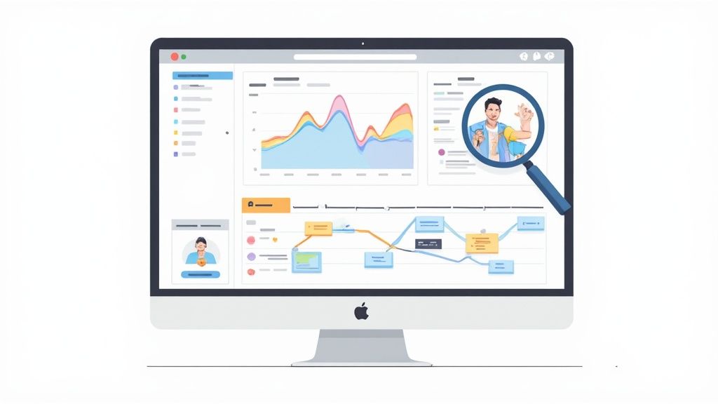
Your analytics platform isn't just a dashboard of numbers. It’s a direct line into your users' heads—a raw feed of their frustrations and "aha!" moments. If you want to seriously improve your website's conversion rate, you have to learn how to listen.
This goes way beyond glancing at vanity metrics like pageviews. It’s about doing a real conversion audit, starting with the pages where people are giving up and walking away. That’s your quantitative data—the hard numbers that tell you what is happening.
Starting with Quantitative Data
Your first stop should be a tool like Google Analytics. The goal here isn't to look at overall traffic; it's to dissect the user journey and find your biggest leaks. These are the pages with unusually high exit rates that are bleeding potential customers.
A few reports will become your best friends:
- Landing Page Reports: These show you the first impression people get. Are they sticking around or bouncing immediately? A high bounce rate here is a classic sign of a mismatch between what your ad promised and what the page delivered.
- Funnel Visualization: If you have goals set up, this report is pure gold. It gives you a step-by-step visual of your conversion path, showing exactly where users drop off between adding an item to their cart and actually paying you.
- Behavior Flow Reports: This one’s a bit more complex but incredibly powerful. It maps out the messy, real-world paths people take through your site—where they get stuck in loops, the weird detours they take, and the dead ends they hit.
Once you’ve got this data, you can start connecting it back to your business goals. Understanding how to measure marketing ROI is fundamental here, as it helps you tie specific user friction directly to lost revenue.
I once worked with a client whose checkout page had a staggering 70% drop-off rate. Analytics told us where the leak was, but it couldn't tell us why. That’s where you need the next layer of data.
Uncovering the "Why" with Qualitative Insights
The numbers tell you what’s happening, but user behavior tools tell you why. This is where qualitative data comes in, giving you the context behind the clicks and helping you develop real empathy for your users.
Tools that provide heatmaps and session recordings are non-negotiable for this. They let you see your website through your visitors' eyes.
- Heatmaps give you an aggregated picture of where users click, move their mouse, and scroll. You can instantly spot which elements are getting attention and which are being completely ignored. I’ve used heatmaps to discover people "rage-clicking" on an image they thought was a button—a crystal-clear sign of a design flaw.
- Session Recordings are like watching over a user's shoulder. You see their mouse movements, where they hesitate, where they get confused, and where they finally give up. Honestly, watching just a handful of recordings of people failing on a problem page is often the fastest way to find a frustrating bug or a confusing piece of copy.
Combining Both Types of Data
The real magic happens when you layer these two types of data. You start with your analytics to find a high-exit page (the "what"). Then, you jump into session recordings and heatmaps for that specific URL to understand the user frustration (the "why").
This two-pronged approach gives you everything you need to form a smart hypothesis. Instead of just guessing, you can build a data-backed case for your ideas.
For example: "Our analytics show a high drop-off on the shipping page, and session recordings show people struggling with the address form. We believe that simplifying the form will improve conversions."
Now you have a clear idea, backed by evidence, ready for an A/B test.
Design an Experience That Guides Users to Act
A slick design might win awards, but a simple, intuitive design is what actually wins customers. This is where user experience (UX) becomes your secret weapon for boosting your website's conversion rate. The goal is to create a journey so effortless and logical that users are guided to act without even thinking about it.
It all starts with a clear visual hierarchy. Think of your webpage like a map where your most important elements—especially your call-to-action (CTA) button—are the most prominent landmarks. Use size, color, and placement to naturally draw the eye exactly where you want it to go.
When someone lands on your page, they should instantly get what to do next. If they have to hunt for the "Buy Now" button, you've already lost.
Make Your Navigation Effortless
Confusing navigation is a certified conversion killer. Ever landed on a site, tried to find something, and just given up after a few frustrating clicks? That’s exactly what we need to avoid. Your navigation menu has to be simple, logical, and predictable.
Organize your site around what your users want to do, not your company's internal structure. Use plain English for menu items. "Our Services" works a lot better than "Synergistic Solutions."
Here’s a quick audit you can do for your own navigation:
- Is it simple? Limit your main menu to the essentials. Too many options create decision paralysis.
- Is it descriptive? People should know exactly what they'll get before they click.
- Is it consistent? Your navigation needs to be in the same place with the same options on every single page.
For a deeper dive into optimizing these specific touchpoints, check out these landing page best practices to boost conversions. They offer some solid, actionable tactics.
I once worked with a SaaS client whose mobile navigation was a complete mess. Users had to tap through three different menus just to find the pricing page. By simplifying it to one clear, accessible menu, we saw a 15% jump in demo requests from mobile users in the first month alone.
Embrace Mobile-First Design
Speaking of mobile, it’s not an option anymore—it’s the standard. A huge chunk of your traffic is coming from smartphones, so your site has to be designed for the small screen first. This isn't just about making your desktop site shrink; it's about rethinking the entire experience for someone on their phone.
Think large, easy-to-tap buttons, simple forms that are a breeze to fill out, and content that's scannable on the go. If your mobile users have to pinch and zoom to read anything, you're creating massive friction.
A true mobile-first approach makes sure the experience is seamless for everyone, no matter the device. Start with the mobile version, then adapt it for larger screens.
Speed Is Everything
Every detail in your design matters, but few are as critical as how fast your page loads. Slow websites frustrate people and kill conversions before anyone even sees your offer. We're talking about a game of seconds, even milliseconds.
The data here is crystal clear. If a page loads in one second, conversion rates can be 2.5 times higher than a page that takes five seconds. The difference is even starker compared to a ten-second load time, where conversions can be five times higher.
To get faster, you need to optimize your images, minimize your code, and invest in good hosting. Every second you shave off your load time is a direct investment in your bottom line.
Write Words That Actually Motivate People
Think of your website's copy as your best salesperson, working 24/7. If it’s vague, generic, or just rattles off features, it's not closing any deals. Great design can guide the eye, but it’s the words that actually persuade the mind.
This is where conversion copywriting shines. It’s less about being clever and more about being clear, empathetic, and compelling enough to get someone to act.
Nail Your Value Proposition First
Before you write a single headline, you have to answer your visitor’s biggest unspoken question: “What’s in it for me?” Your value proposition is the promise of value you make to a customer. It should be the first thing they see and understand in seconds.
A strong value proposition isn't a fluffy slogan or a mission statement. It’s a dead-simple explanation of the tangible results a customer gets from you. If you’re struggling here, you need to step back. The first move is to learn how to create a value proposition that connects with what your audience actually needs.
For example, a project management tool doesn’t just "organize tasks." It "stops project chaos and helps your team hit every deadline." One is a feature; the other is a benefit.
Shift From Features to Benefits
This is probably the most common copywriting mistake I see: leading with features. Your dev team might be proud of your software's "asynchronous data processing," but your customer just wants to know that your app will be "lightning-fast, even with huge files." Always translate your product’s features into your customer’s real-world benefits.
Here’s a simple way to think about it:
-
Feature: "Our gym has state-of-the-art equipment."
-
Benefit: "Get a better workout in less time with equipment designed to help you reach your fitness goals faster."
-
Feature: "This CRM integrates with 50+ apps."
-
Benefit: "Connect all your tools in one place and stop wasting time switching between tabs."
This small shift in focus changes everything. It puts the customer, not your product, at the center of the story.
Your customers don't care about your product; they care about their problems. Your copy needs to build a bridge between the two, showing them exactly how you solve their specific pain points and help them achieve their dreams.
Write Headlines and CTAs That Drive Action
Your headline has exactly one job: to get the first sentence read. It needs to grab attention and promise a solution to a problem. Use numbers, ask a sharp question, or state the main benefit directly. A headline like "Finally, a Way to Manage Team Projects Without the Meetings" is way more powerful than "Our Project Management Platform."
The same goes for your calls-to-action (CTAs). They must be clear, compelling, and create a little urgency. Ditch the generic "Submit." Try something specific and benefit-focused like "Get My Free Marketing Plan" or "Start My 14-Day Trial." Adding a touch of scarcity, like "Limited Spots Available," can give people the final nudge they need to act now.
Build Trust with Social Proof
No matter how persuasive your copy is, people will always trust other customers more. That’s why social proof isn't a "nice-to-have"—it's an absolute must-have for conversion. You need to sprinkle it strategically throughout your site to build instant credibility.
Here are the most effective forms of social proof:
- Testimonials: Short, punchy quotes from happy customers that highlight specific, measurable results.
- Case Studies: More detailed stories showing the "before and after" of working with you.
- Logos: Showing logos of well-known companies you've worked with builds immediate authority.
- Reviews and Ratings: Simple star ratings give a quick visual cue of customer satisfaction.
Placing a relevant testimonial right next to a CTA can be the final piece of assurance a hesitant visitor needs. Your copy makes the promise; social proof proves you can deliver on it.
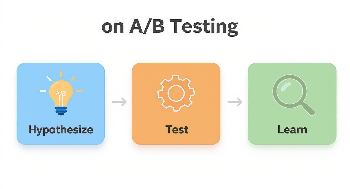
Test Your Ideas to Find What Truly Works
In conversion optimization, assumptions are the most expensive thing you can own. You've dug through the data, watched the session replays, and feel like you know exactly what to fix. It's tempting to just push those changes live and hope for the best.
But hope isn't a strategy. The only way to know for sure if a change actually moves the needle is to test it.
This is where A/B testing, or split testing, comes in. The concept is beautifully simple: you show two versions of a page to your audience—the original (your control) and a new version (the variation)—to see which one performs better. It’s a methodical approach that takes the guesswork out of the equation and lets your users vote with their clicks.
From Insight to a Testable Hypothesis
Every good test starts with a strong, data-backed hypothesis, not a random "what if." All that research you did earlier—analyzing heatmaps and identifying friction points—was leading to this exact moment. Your job now is to turn those raw insights into a clear, testable statement.
A solid hypothesis usually follows this structure: "If I change [X], then [Y] will increase because [of this reason]."
Here’s what that looks like in the real world:
- Insight: "Our analytics show a huge drop-off at the cart, and session recordings show users hesitating right when they see unexpected shipping costs."
- Hypothesis: "If we change the CTA button text from 'Continue to Checkout' to 'Calculate Shipping & Checkout,' then the checkout completion rate will increase because it addresses the user's anxiety about hidden costs upfront."
See the difference? This isn't just a guess; it's an educated prediction rooted in what you've seen people do. It’s specific, it’s measurable, and it gives you a clear benchmark for success.
A common mistake is testing for the sake of testing—like changing a button color just because someone on the team doesn't like it. A winning testing program is driven by solving real user problems you've already identified, not by chasing minor aesthetic tweaks.
Structuring Your First A/B Test
With your hypothesis ready, it's time to set up the experiment. A few practical steps here will make sure your results are trustworthy and not just a fluke. You need to pick one element to change, figure out how many people need to see it, and decide how long to let it run.
Here’s a practical checklist to get you started:
- Isolate Your Variable: Only change one thing at a time. If you change the headline, the button color, and the main image all at once, you’ll have no idea which change actually caused the result.
- Determine Your Sample Size: Use an A/B test calculator to figure out how many visitors you need in each group to get a statistically significant result. This stops you from calling a winner based on too little data.
- Run for a Full Business Cycle: Let your test run for at least one to two weeks. This helps smooth out any weird fluctuations from day-to-day traffic, like a quiet weekend versus a busy Monday.
Most modern testing tools like VWO or Optimizely make the technical setup surprisingly straightforward. You can often use a visual editor to create your variation without needing to write a single line of code.
A Simple Framework for Prioritizing A/B Tests
Once you start brainstorming, you'll have more test ideas than you can possibly run. The key is to focus on the ones that will make the biggest difference with the least amount of heavy lifting.
This simple scoring method helps you decide which tests to tackle first. Just rate each idea on a scale of 1 to 5 for each category, add up the scores, and you've got your priority list.
| Test Idea | Potential Impact (1-5) | Confidence Level (1-5) | Ease of Implementation (1-5) | Priority Score |
|---|---|---|---|---|
| Change Homepage Headline | 5 | 4 | 5 | 14 |
| Add Trust Badges to Checkout | 4 | 5 | 4 | 13 |
| Redesign Entire Product Page | 5 | 3 | 1 | 9 |
| Change Footer Link Color | 1 | 2 | 5 | 8 |
This framework isn't perfect, but it forces you to think critically about each idea's potential and brings a much-needed dose of objectivity to your roadmap. Start with the highest scores and work your way down.
Interpreting the Results and Learning from Them
Once the test is over, you’ll have your data. Sometimes, you get a clear winner, and the path forward is obvious. But often, the results are flat or inconclusive. This is not a failure—it's a learning opportunity.
An inconclusive test tells you that the change you made didn't matter enough to your users to alter their behavior. That insight is incredibly valuable. It means you can stop wasting time on that element and focus your energy on a different problem your data has uncovered.
The goal of A/B testing isn't just to find "winners." It's to build a culture of continuous learning. Every experiment, win or lose, teaches you something new about your audience—what they care about, what motivates them, and what gets in their way. This growing library of knowledge is the real engine behind sustainable conversion growth.
Build a System for Continuous Growth
Improving your website's conversion rate isn't a project with a finish line. Think of it as a continuous loop: you learn, adapt, and improve. Once you start testing, you’re not just chasing a quick win; you’re building a system that fuels sustainable growth for the long haul.
This system is what separates one-off tweaks from a strategic program. The real goal is to build a library of knowledge unique to your audience, turning every test—win or lose—into a valuable insight that sharpens your next move.
Look Beyond the Main Conversion Rate
While your primary conversion goal (like a sale or a demo request) is the star of the show, focusing on it exclusively is shortsighted. Real growth comes from understanding the entire customer journey, including all the small steps people take along the way. These are your micro-conversions.
Think of them as the supporting actors in your conversion story:
- Signing up for a newsletter
- Downloading a whitepaper
- Watching a product video
- Adding an item to the cart
Tracking these smaller commitments helps you see where people are engaging, even if they aren't ready to buy just yet. It gives you a much fuller picture of your site's health and provides more data points to work with.
Don't just obsess over the final sale. Optimizing the small "yeses" along the user's journey has a ripple effect. It often makes the big "yes" at the end feel like a natural and easy decision.
Document and Share Your Learnings
I can't stress this enough: the most important part of a growth system is documentation. An experiment that isn't recorded is an insight lost forever. You need to create a simple, shared log of every single test you run.
Your log should capture a few key things:
- The Hypothesis: What did you believe would happen and why? Be specific.
- The Result: A clear summary of the data. Was the test a winner, a loser, or inconclusive?
- The Insight: This is the gold. What did you learn about your audience from this result?
This simple process brings the core loop of optimization—hypothesize, test, and learn—to life. It’s the engine for continuous improvement.
Often, the insights from one test reveal deeper truths about your customers' motivations that you can apply everywhere. For example, a winning headline on a landing page might inspire a whole new batch of email subject lines. This is how small tests create a widespread impact across all your marketing. You can even use this knowledge to refine your broader engagement strategies. For a deeper look at connecting these dots, our guide on how to implement marketing automation offers practical next steps.
FAQs
Got questions about conversion rates? Most people do. Here are the straight answers to a few we hear all the time.
What Is a Good Website Conversion Rate?
Honestly? There isn't one magic number. A "good" rate depends entirely on your industry, who you're selling to, and what you're asking them to do.
An e-commerce store might be thrilled with 2-3%. A B2B company getting 5% of visitors to book a demo is probably crushing it. The context is everything.
Instead of chasing vague industry benchmarks, focus on your own numbers. Your real goal is steady, incremental improvement.
Stop comparing your numbers to everyone else's. A 1% lift this quarter is a huge win that builds on itself. The only benchmark that truly matters is your own past performance.
How Long Should I Run an A/B Test?
It all comes down to traffic. You need enough data to hit statistical significance—usually a 95% confidence level—otherwise, your "winner" might just be a fluke.
As a rule of thumb, let a test run for at least one full business cycle. That's typically one to two weeks. This helps iron out the daily wrinkles in user behavior, like a slow weekend versus a busy Monday morning.
If you have a high-traffic site, you might get clear results in just a few days. Lower-traffic sites have to be more patient and let the data accumulate for a bit longer.
Should I Focus on Big Redesigns or Small Tweaks?
Both. A smart optimization plan uses a mix of the two.
Small, iterative tweaks are your bread and butter for ongoing improvement. You can test a new headline, button color, or CTA and get learnings in a matter of days. It’s low-risk and keeps the momentum going.
But sometimes, small changes won't fix a fundamental problem. If your user data screams that the entire journey is broken or your value prop is confusing, a bigger redesign—backed by solid user research—is probably what you need to see a real breakthrough. A good approach is to start small, bank some wins, and use those insights to inform any larger projects down the road.
Ready to stop guessing and start building a data-driven growth engine? Value CMO provides the senior marketing leadership you need to clarify your strategy, fix your pipeline, and accelerate revenue. Get your focused, no-fluff growth roadmap today.